In this tutorial, we will create a Gym Fitness Website Using HTML & CSS. This step-by-step guide focuses on using HTML and CSS to build a simple, yet visually engaging, front-end template for a fitness website. Our gym fitness website design will include an immersive background, a clean navigation menu, and an interactive form.
By the end of this tutorial, you’ll know how to use HTML and CSS to develop a responsive and professional-looking website for the fitness industry.
Why Create a Gym Fitness Website Using HTML & CSS?
A Gym Fitness Website Using HTML & CSS is ideal for attracting potential members and displaying fitness services in an accessible way. With a dark theme, vibrant button interactions, and a layout that highlights content, this design captures the energy of a gym environment. Whether you’re a developer or a fitness enthusiast, this guide will help you set up a website with essential components like a navigation bar, interactive buttons, and a stylish registration form.
Setting Up the Layout for the Gym Fitness Website
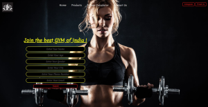
This gym fitness website template is designed to provide an inviting and engaging experience for users. The layout features a full-screen background image, setting an energetic and motivational tone for visitors. The color palette consists primarily of dark tones, with accents of red, yellow, and white, giving a sleek, professional look.
The header section includes three main sections:
- Left: Displays the gym’s logo or branding image.
- Center: Houses the navigation menu, which links to essential sections like Home, Products, Fitness Calculator, and Contact Us.
- Right: Includes call-to-action buttons for Instagram and Email Us, allowing users to quickly connect via social media or email.
A primary feature of the page is the container section, which introduces the gym with a bold headline: “Join the best GYM of India!” Below the headline, a simple registration form allows users to enter their name, age, gender, city, phone number, and email. Each form field is styled with yellow text on a black background and rounded borders, adding to the site’s modern look. A “Submit” button in red and black completes the form, designed to capture user details for potential membership or queries.
The website uses a font style that is casual yet elegant, enhancing readability and adding a touch of personality to the design. Additionally, subtle hover effects on navigation links and buttons provide interactivity, encouraging users to explore further. This template creates a professional yet approachable impression, likely to appeal to fitness enthusiasts and gym-goers looking for a high-quality facility.
Code Snippet
<!DOCTYPE html>
<html lang="en">
  <head>
    <meta charset="UTF-8" />
    <meta name="viewport" content="width=device-width, initial-scale=1.0" />
    <title>My Fitness</title>
    <link rel="preconnect" href="https://fonts.googleapis.com">
<link rel="preconnect" href="https://fonts.gstatic.com" crossorigin>
<link rel="preconnect" href="https://fonts.googleapis.com">
<link rel="preconnect" href="https://fonts.gstatic.com" crossorigin>
    <style>
        @import url('https://fonts.googleapis.com/css2?family=Merienda:wght@300&family=Yatra+One&display=swap');

      body {
        margin: 0px; /*CSS Reset*/
        padding: 0px; /*CSS Reset*/
        background-image: url(img4.jpg);
        background-repeat: no-repeat;
        height: 100vh;
        width: 100%;
        background-position: center;
        background-size: cover;
        font-family: 'Merienda', cursive;
      }
      .left {
        display: inline-block;
        position: absolute;
        top: 20px;
        left: 24px;
        color: wheat;
        /* border: 2px solid red; */
      }
      .left img{
        width: 75px;
      }
      .mid {
        display: block;
        width: 50%;
        margin: 12px auto;
        top: 20px;

        color: wheat;
        /* border: 2px solid yellow; */
        list-style: none;
    }

    .right {
        display: inline-block;
        position: absolute;
        top: 20px;
        right: 24px;
        color: wheat;
        /* border: 2px solid blue; */

    }
    .navbar{
        display: inline-block;


}
.navbar li{
        display: inline-block;
        font-size: 17px;

    }
    .navbar li a{
        color: white;
        padding: 20px 15px;
        text-decoration: none;

    }
    .navbar li a:hover{
        color: yellow;
        text-decoration: underline;

    }
    .btn{
        border: 2px solid red;
        color: red;
        background: black;
        border-radius: 6px;
        padding: 4px 10px;
        cursor: pointer;
    }
    .btn:hover{
        color: yellow;
        background:black;
        border: 2px solid yellow;
    }
    .container{color: aliceblue;
        /* border: 2px solid wheat; */
        width: 600px;
    padding: 9px 26px;
    /* margin: 70px; */
    border-radius: 15px;
    margin-top: 163px;
    margin-left: 69px;
    }
    .group input{    display: block;
    border: 2px solid yellow;
    text-align: center;
    width: 400px;
    padding: 4px 3px;
    margin: 11px auto;
    border-radius: 15px;
    font-size: 15px;
    background: black;
    color: yellow;
    font-family: 'Merienda', cursive;

    }
    .container h1{
        text-align: center;
        color: yellow;
    }
    .container button{
        display: block;
        width: 50.5%;
        margin: auto;
        margin-top:5px ;
    }
    </style>
  </head>
  <body>
    <header class="header">
      <div class="left">
        <img src="img2.png" alt="">
      </div>
      <div class="mid" id="center">
        <ul class="navbar">

            <li><a href="#">Home</a></li>
            <li><a href="#">Products</a></li>
            <li><a href="#">Fitness Calculator</a></li>
            <li><a href="#">Contact Us</a></li>
        </ul>
      </div>
      <div class="right">
        <button class="btn">Instagram </button>
        <button class="btn">Email Us</button>
      </div>
    </header>
    <div class="container">
       <h1><u>Join the best GYM of India !</u></h1>
       <form action="noaction.php">
        <div class="group">
           <div>
            <input type="text" name="" placeholder="Enter Your Name">
           </div>
           <div>
            <input type="text" name="" placeholder="Enter Your Age">
           </div>
           <div>
            <input type="text" name="" placeholder="Enter Your Gender">
           </div>
           <div>
            <input type="text" name="" placeholder="Enter Your City">
           </div>
           <div>
            <input type="text" name="" placeholder="Enter Your Phone Number">
           </div>
           <div>
            <input type="text" name="" placeholder="Enter Your Email">
           </div>

        </div>
    </form>
    <button class="btn">Submit </button>

    </div>
  </body>
</html>
OUTPUT
Styling the Form in Your Gym Fitness Website
The CSS part of this gym fitness website code controls the visual layout, styling, and user interaction effects. Here’s a breakdown of each CSS section:
1. Global Styles and Resets
body {
   margin: 0px; /* Removes default margin */
   padding: 0px; /* Removes default padding */
   background-image: url(img4.jpg); /* Sets background image */
   background-repeat: no-repeat; /* Prevents image repetition */
   height: 100vh; /* Full viewport height */
   width: 100%; /* Full width */
   background-position: center; /* Centers the background image */
   background-size: cover; /* Scales image to cover the entire background */
   font-family: 'Merienda', cursive; /* Applies custom font */
}
The global styles remove default margins and paddings, creating a uniform appearance across browsers. Additionally, the background image covers the whole page, contributing to an immersive and visually appealing layout. By setting the font-family to a Google font, the design gains a personalized touch.
2. Header Layout and Sections
.left, .mid, .right {
   color: wheat; /* Text color */
}
.left {
   display: inline-block;
   position: absolute;
   top: 20px;
   left: 24px;
}
.left img {
   width: 75px; /* Logo size */
}
The .left class places the logo on the top-left corner of the page, with a bit of spacing from the edges for readability. Meanwhile, .left img resizes the logo image to keep it well-proportioned within the header.
.mid {
   display: block;
   width: 50%;
   margin: 12px auto;
   top: 20px;
   list-style: none; /* Removes bullets from list items */
}
In the center section, .mid displays the navigation menu. It removes list item bullets for a cleaner look.
.right {
   display: inline-block;
   position: absolute;
   top: 20px;
   right: 24px;
}
The .right class aligns the contact buttons (Instagram and Email) on the top-right side of the header, balancing the layout.