The logout dialog may seem like a minor part of a digital interface, but its impact on user experience (UX) is significant. A poorly designed logout flow can frustrate users, disrupt workflows, or lead to accidental logouts. On the other hand, a well-designed logout dialog provides clarity, ensures intentional actions, and enhances the overall user experience.
In this UI/UX-focused tutorial, we’ll explore best practices, key design principles, and real-world examples to help you create effective and user-friendly logout dialogs.
What Is a Logout Dialog?
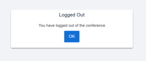
A logout dialog is a confirmation modal that appears when a user initiates the logout action. It typically asks the user to confirm their decision, preventing accidental logouts and providing an opportunity to convey important information, such as unsaved changes.
Why Is Logout Dialog Design Important?
1. Prevents Accidental Actions
A logout dialog serves as a safety net, ensuring users don’t inadvertently log out due to mis-clicks.
2. Communicates the Impact
It provides a chance to inform users about any consequences, such as unsaved data or disrupted processes.
3. Enhances User Trust
A clear and considerate design reassures users that the system prioritizes their control and understanding.
Key Principles of Effective Logout Dialog Design
1. Clarity in Messaging
The logout dialog should clearly communicate the action being confirmed. Avoid jargon and use straightforward language like:
“Are you sure you want to log out?”
2. Prioritize the Primary Action
Make the logout button visually prominent, while the cancel button is less emphasized but still accessible.
3. Minimize Friction
The dialog should simplify the decision-making process, not complicate it. Avoid overwhelming users with unnecessary options.
4. Provide Context
If logging out will lead to unsaved changes, incomplete actions, or other consequences, communicate this clearly.
5. Ensure Accessibility
Design for all users by ensuring the dialog is screen-reader friendly, keyboard-navigable, and visually clear.
How to Design a Logout Dialog: A Step-by-Step Process
Step 1: Understand the User Flow
Map out the scenarios where a logout dialog is necessary. For example:
- User clicks on a “Log Out” button in the navigation menu.
- Automatic session timeout triggers a logout warning.
Key Consideration: Identify moments where users may need extra confirmation to prevent accidental actions.
Step 2: Craft the Content
Write concise, user-centered copy for the dialog. Here’s an example:
Header: “Confirm Logout”
Body Message: “Are you sure you want to log out? Any unsaved changes will be lost.”
Buttons:
- Primary Action: “Log Out” (highlighted in a noticeable color, e.g., red).
- Secondary Action: “Cancel” (less prominent, e.g., in gray).
Step 3: Design the Interface
Focus on visual hierarchy and simplicity.
- Modal Layout:
- Use a centered modal box with a clear title, body text, and buttons.
- Color Usage:
- Highlight the logout action with a distinct color (e.g., red or blue).
- Use neutral tones for the cancel action.
- Spacing and Alignment:
- Ensure buttons and text are properly aligned and spaced to avoid accidental clicks.
Step 4: Add Contextual Feedback
- For Unsaved Changes: Include a warning like:
“You have unsaved changes. Logging out will discard these changes.” - Session Timeout: Add a countdown timer or warning to inform users why they’re being logged out.
Step 5: Test and Iterate
Conduct usability testing to gather feedback. Pay attention to:
- Ease of Understanding: Do users immediately grasp the message?
- Error Prevention: Are accidental logouts minimized?
- Accessibility: Can users with assistive technologies navigate the dialog effortlessly?
Best Practices for Logout Dialog UX Design
- Avoid Overusing Confirmation Modals
Use logout dialogs only when necessary. Don’t force users into unnecessary steps for actions they perform frequently. - Keep it Simple
The dialog should be minimal and straightforward. Overloading users with options dilutes the primary purpose. - Make Actions Reversible
Consider adding a session restore option if users log out unintentionally. - Be Mobile-Friendly
Ensure the dialog is optimized for smaller screens, with large, tappable buttons and readable text.
Real-World Examples of Logout Dialogs
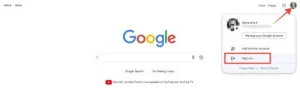
1. Google Services
Google’s logout dialogs are concise and focus on the action. They also highlight any potential impacts, such as syncing data when switching accounts.
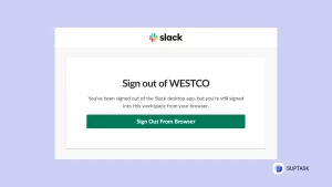
2. Slack
Slack provides a clear confirmation dialog with well-spaced buttons and consistent visual design, ensuring no accidental clicks.
3. Banking Apps
Banking applications often include warnings about unsaved transactions or incomplete processes before logging out.
Conclusion
A logout dialog may be a small part of your application, but its design greatly influences the user experience. By focusing on clarity, accessibility, and user control, you can create a logout flow that is both functional and user-friendly.
Remember, every interaction—even something as simple as logging out—should leave users with a positive impression of your product.