Hover effects are an essential part of web design, as they can significantly enhance user experience and make your website more interactive. In fact, a well-designed hover effect draws attention to important elements, provides visual feedback, and even adds a touch of creativity to your site. Therefore, in this blog post, we’ll explore how to create custom CSS hover effects that will make your website truly stand out.
Why Use Hover Effects?
Hover effects are triggered when a user moves their mouse over a particular element. As a result, they provide immediate feedback, making the website feel more dynamic and interactive. Moreover, they can enhance the overall user experience by improving engagement and guiding user actions. Here are a few benefits of using hover effects:
- Improved User Engagement: In fact, hover effects can encourage users to interact more with your content, making it feel more engaging and lively.
- Visual Feedback: Additionally, they help users understand which elements are clickable, thereby improving navigation.
- Aesthetic Appeal: Lastly, custom hover effects can make your site look modern and polished, contributing to a more professional appearance.
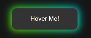
Glowing Button
1. Index.html
<!DOCTYPE html>
<html lang="en">
<head>
  <meta charset="UTF-8">
  <meta http-equiv="X-UA-Compatible" content="IE=edge">
  <meta name="viewport" content="width=device-width, initial-scale=1.0">
  <link rel="stylesheet" href="style.css">
  <title>CSS Button Glow Effect</title>
</head>
<body>
  <button class="btn">Hover Me!</button>
</body>
</html>
4. Style.css
html, body {
  display: flex;
  justify-content: center;
  align-items: center;
  background-color: #161616;
  overflow: hidden;
  /* transform: scale(1.5); */
}

/* button */
.btn {
  margin: 100px;
  padding: 15px 40px;
  border: none;
  outline: none;
  color: #FFF;
  cursor: pointer;
  position: relative;
  z-index: 0;
  border-radius: 12px;
}
.btn::after {
  content: "";
  z-index: -1;
  position: absolute;
  width: 100%;
  height: 100%;
  background-color: #333;
  left: 0;
  top: 0;
  border-radius: 10px;
}
/* glow */
.btn::before {
  content: "";
  background: linear-gradient(
    45deg,
    #FF0000, #FF7300, #FFFB00, #48FF00,
    #00FFD5, #002BFF, #FF00C8, #FF0000
  );
  position: absolute;
  top: -2px;
  left: -2px;
  background-size: 600%;
  z-index: -1;
  width: calc(100% + 4px);
  height:  calc(100% + 4px);
  filter: blur(8px);
  animation: glowing 20s linear infinite;
  transition: opacity .3s ease-in-out;
  border-radius: 10px;
  opacity: 0;
}

@keyframes glowing {
  0% {background-position: 0 0;}
  50% {background-position: 400% 0;}
  100% {background-position: 0 0;}
}

/* hover */
.btn:hover::before {
  opacity: 1;
}

.btn:active:after {
  background: transparent;
}

.btn:active {
  color: #000;
  font-weight: bold;
}
Output

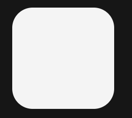
Color Change with Transition
Adding a smooth transition makes the hover effect look more professional.
.card {
  background-color: #f4f4f4;
  padding: 20px;
  border-radius: 8px;
  transition: background-color 0.3s ease;
}

.card:hover {
  background-color: #e0e0e0;
}
Output :

Tips for Designing Hover Effects
When designing hover effects, it’s important to follow best practices to ensure they enhance your website without causing usability issues. Here are some tips to keep in mind:
- Keep It Subtle: Over-the-top effects can be distracting. Therefore, it’s best to keep your effects subtle and consistent to maintain a professional look.
- Maintain Accessibility: Additionally, ensure that your hover effects do not hinder readability or usability. For instance, avoid using effects that make text hard to read or confuse users.
- Test Across Devices: Furthermore, remember that hover effects work well on desktop devices but may not have the same impact on touch devices. As a result, consider providing alternative interactions for mobile users to ensure a seamless experience.
Conclusion
In conclusion, custom CSS hover effects can transform a basic website into a visually appealing and interactive experience. By applying these creative effects, you can significantly improve user engagement and make your website stand out from the crowd. Moreover, experimenting with different styles and combinations will help you discover what best fits your brand and audience. Therefore, don’t hesitate to explore various possibilities and add a unique touch to your site.
Happy coding!