A circular progress bar is a graphical control used to visually represent the completion of a task or the status of a process. Unlike traditional linear progress bars, circular progress bars fill in a circular motion around a central point, offering a more dynamic and engaging way to display progress.
Circular progress bars are used in various web design applications, such as loading indicators, form progress trackers, performance metrics visualizations, and countdown timers. They enhance user interfaces by providing a visually appealing and easy-to-understand way to convey information.
By the end of this tutorial, readers will know how to make a circular progress bar using HTML, CSS, and JavaScript. They’ll learn to set it up, style it, and make it work dynamically, adding a modern touch to their web projects.
Let’s get started.
Step-1: Set up the HTML Structure.
The HTML sets up the structure for a circular progress bar, starting with standard document setup. Within a container div class “circular,” it includes elements for inner space (“inner” div) and percentage display (“numb” div). The progress bar is crafted within a “circle” div, housing two bars (“left” and “right”), enclosing “Progress” div’s.
<!DOCTYPE html>
<html lang="en">
<head>
    <meta charset="UTF-8">
    <meta name="viewport" content="width=device-width, initial-scale=1.0">
    <title>Progress Bar</title>
    <link rel="stylesheet" href="style.css">
</head>
<body>
    <div class="circular">
        <div class="inner"> </div>
        <div class="numb"></div>
        <div class="circle">
        <div class="bar left">
            <div class="Progress"></div>
        </div>
        <div class="bar right">
            <div class="Progress"></div>
        </div>
      </div>
    </div>
    <script>
        const numb=document.querySelector(".numb");
        let c=0;
        setInterval(()=>{
            if(c==100){
                clearInterval()
            }else{
                c++;
                numb.innerHTML=c+"%";
            }
        },80)
    </script>
</body>
</html>
Step-2: JavaScript Code for Displaying Dynamic Percentage.
This JavaScript code starts the countdown animation for a circular progress bar. It begins by picking the HTML element with the class “numb” to show the progress percentage. Then it creates a counter variable, “c”, which is initialized to 0. Using the setInterval() method, the code increases “c” by 80 milliseconds until it reaches 100. During each cycle, the value of “c” is displayed within the “numb” element, which dynamically updates the progress %. When “c” reaches 100, the animation ends.
Step-3: Styling the Dynamic Progress Animation.
This CSS code creates a dynamic circular progress bar. It resets margins, selects a font, and centers the content vertically and horizontally. The circular form and inner parts are positioned and stylized, as are the two bars for the progress animation. The left and right bars are animated by turning them 180 degrees during a 4-second period.
*{
    margin: 0;
    padding: 0;
    box-sizing: border-box;
    font-family:'Times New Roman', Times, serif;
}
html,body{
    display: grid;
    height: 100%;
    text-align: center;
    place-items: center;
    background: #dde6f0;
}
.circular{
    height: 100px;
    width: 100px;
    position: relative;
    transform: scale(2);
}
.circular .inner{
    position: absolute;
    z-index: 6;
    height: 80px;
    width: 80px;
    top: 50%;
    left: 50%;
    margin: -40px 0 0 -40px;
    background: #dde6f0;
    border-radius: 100%;
    box-shadow: 0 1px 0 rgba(0,0,0,0.4);
}
.circular .numb{
    position: absolute;
    top: 40%;
    left: 33.5%;
    transform: translate(-50% -50%);
    color: #ef5959;
    z-index: 10;
    font-size: 18px;
    font-weight: 500;
}
.circular .bar{
    position: absolute;
    height: 100%;
    width: 100%;
    background: white;
    border-radius: 100%;
    clip: rect(0px 100px 100px 50px);
}
.circle .bar .Progress{
    position: absolute;
    height: 100%;
    width: 100%;
    -webkit-border-radius: 100%;
    clip: rect(0px 50px 100px 0px);
    background: #67bc17;
}
.circle .left .Progress{
    z-index: 1;
    animation: left 4s linear both;
}
@keyframes left {
    100%{
        transform: rotate(180deg);
    }
}
.circle .right {
    z-index: 3;
    transform: rotate(180deg);

}
.circle .right .Progress{
    animation: right 4s linear both;
    animation-delay: 4s;
}
@keyframes right{
    100%{
        transform: rotate(180deg);
    }
}
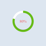
Output: