A common feature of web forms are radio buttons, which let users choose one choice from a given list. By making these buttons dynamic, the user experience is improved. In this blog post, we’ll use HTML, CSS, and JavaScript to construct a dynamic and attractive radio button form.
In forms where the user must choose one option from a list of options, radio buttons are frequently used. Although radio buttons in browsers by default have a design, it is sometimes not very attractive. The user interface can be greatly enhanced by using unique styles and some JavaScript for dynamic behavior.
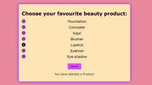
Creating a radio button.
We’ll develop a form that allows users to choose their favourite beauty product. This consists of three primary parts:
HTML – for the framework
CSS – for styling
JavaScript – for interactive applications
- 3.html
The framework for our form is provided by HTML. To improve usability, labels are attached to each radio button.
<!DOCTYPE html>
<html lang="en">
<head>
    <meta charset="UTF-8">
    <meta name="viewport" content="width=device-width, initial-scale=1.0">
    <title>Radio Button</title>
    <link rel="stylesheet" href="3.css">
</head>
<body>
    <div class="container">
        <h1>Choose your favourite beauty product:</h1>
        <form id="beautyproductform">
            <label class="radio-container">Foundation
                <input type="radio" name="beauty" value="Foundation">
                <span class="checkmark"></span>
            </label>

            <label class="radio-container">Concealer
                <input type="radio" name="beauty" value="Concealer">
                <span class="checkmark"></span>
            </label>

            <label class="radio-container">Kajal
                <input type="radio" name="beauty" value="Kajal">
                <span class="checkmark"></span>
            </label>

            <label class="radio-container">Blusher
                <input type="radio" name="beauty" value="Blusher">
                <span class="checkmark"></span>
            </label>

            <label class="radio-container">Lipstick
                <input type="radio" name="beauty" value="Lipstick">
                <span class="checkmark"></span>
            </label>

            <label class="radio-container">Eyeliner
                <input type="radio" name="beauty" value="Eyeliner">
                <span class="checkmark"></span>
            </label>

            <label class="radio-container">Eye shadow
                <input type="radio" name="beauty" value="Eye shadow">
                <span class="checkmark"></span>
            </label>
            <button type="button" onclick="submitForm()">Submit</button>
        </form>
        <p id="result"></p>
    </div>

    <script src="3.js"></script>

</body>
</html>
- 3.css
The radio button’s presentation and the form’s general design are improved by the CSS. The radio buttons have their default appearance changed to a more attractive style by applying custom styles.
body{
    font-family: Verdana, Geneva, Tahoma, sans-serif;
    display: flex;
    justify-content: center;
    align-items: center;
    height: 100vh;
    background-color: rgba(216, 48, 88, 0.573);
    margin: 0;
}

.container{
    background: moccasin;
    padding: 20px;
    border-radius: 10px;
    box-shadow: 0 0 20px rgb(136, 23, 249);
    text-align: center;
}

h1{
    margin-bottom: 20px;
}

.radio-container{
    display: block;
    position: relative;
    padding-left: 35px;
    margin-bottom: 12px;
    cursor: pointer;
    font-size: 22px;
    user-select: none;
}

.radio-container input{
    position: absolute;
    opacity: 0;
    cursor: pointer;
}

.checkmark{
    position: absolute;
    top: 0;
    left: 0;
    height: 25px;
    width: 25px;
    background-color: rgb(145, 59, 187);
    border-radius: 50%;
}

.radio-container:hover input ~ .checkmark{
    background-color: rgb(196, 121, 121);
}

.radio-container input:checked ~ .checkmark{
    background-color: rgb(13, 14, 13);
}

.checkmark::after{
    content: "";
    position: absolute;
    display: none;
}

.radio-container input:checked ~ .checkmark::after{
    display: block;
}

.radio-container .checkmark::after{
    top: 9px;
    left: 9px;
    width: 8px;
    height: 8px;
    border-radius: 50%;
    background: rgb(248, 143, 207);
}

button{
    margin-top: 20px;
    padding: 10px 20px;
    background-color:rgb(222, 71, 249);
    color: rgb(9, 5, 5);
    border: none;
    border-radius: 5px;
    cursor: pointer;
    font-size: medium;
}

button:hover{
    background-color: peachpuff;
}

#result{
    margin-top: 20px;
    font-size: 18px;
    color: rgb(1, 8, 9);
}
- 3.js
By storing the value of the selected radio button and by displaying it after the form is submitted, JavaScript provides interaction.
function submitForm(){
    const form = document.getElementById('beautyproductform');
    const formData = new FormData(form);
    const selectedBeautyProduct = formData.get('beautyProduct');
    const result = document.getElementById('result');

    if (selectedBeautyProduct) {
       result.textContent = 'You have selected a Product!';
    }

    else{
        result.textContent = 'Please select..';
    }
}
OUTPUT :
We can construct an interactive radio button form by using JavaScript, CSS, and HTML. This method improves the user experience.