BEAUTY SALOON WEBPAGE TEMPLATE USING HTML, CSS AND JS
Creating a responsive and functional Beauty Salon webpage template involves using HTML for structure, CSS for styling, and JavaScript for any interactive features.
- First, we will create a HTML file and then add basic layout feature of our Beauty Saloon template in it.
- For this, we add <header> element that contains the salon name and navigation links and main that wraps the main content sections for Services, About Us, and Contact.
- Each <section > has a unique ID (services, about, contact) for navigation and styling purposes
- And, finally the <footer> that contains copyright information.
And then its done in HTML and we need to add our CSS styling.
<!DOCTYPE html>
<html lang="en">
<head>
<meta charset="UTF-8">
<meta name="viewport" content="width=device-width, initial-scale=1.0">
<title>Beauty Salon</title>
<link rel="stylesheet" href="styles.css">
</head>
<body>
<header>
<div class="container">
<h1>Beauty Salon</h1>
<nav>
<ul>
<li><a href="#services">Services</a></li>
<li><a href="#about">About Us</a></li>
<li><a href="#contact">Contact</a></li>
</ul>
</nav>
</div>
</header>
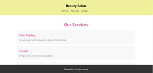
<section id="services">
<div class="container">
<h2>Our Services</h2>
<div class="service">
<h3>Hair Styling</h3>
<p>Get advanced and trending hair styles by Professionals.</p>
</div>
<div class="service">
<h3>Facials</h3>
<p>All types of Facial facilities are available.</p>
</div>
<div class="service">
<h3>Manicure & Pedicure</h3>
<p>Get premium Manicure and Precidure done by us with effective results.</p>
</div>
</div>
</section>
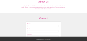
<section id="about">
<div class="container">
<h2>About Us</h2>
<p>Accepting New Clients and Walk ins. Scheduling by the internet is preferred, but appointments by phone is Always welcome. If you have any problems scheduling online, please call Salon 256-232-6600. Also we offer Senior discounts for 65 years and older.</p>
</div>
</section>
<section id="contact">
<div class="container">
<h2>Contact</h2>
<form action="#" method="POST">
<label for="name">Name:</label>
<input type="text" id="name" name="name" required>
<label for="email">Email:</label>
<input type="email" id="email" name="email" required>
<label for="message">Message:</label>
<textarea id="message" name="message" required></textarea>
<button type="submit">Send</button>
</form>
</div>
</section>
<footer>
<div class="container">
<p>©Beauty Salon. All rights reserved.</p>
</div>
</footer>
<script src="script.js"></script>
</body>
</html>
Now, we will add CSS styling to make this template more visually appealing.
- Responsive design achieved through percentage-based widths and max-width constraints.
- We use color scheme (#333 for header/footer background, #fff for text) provides contrast and readability.
- Whereas, sections (#services, #about, #contact) styled with background colors and padding for separation.
* {
    margin: 0;
    padding: 0;
    box-sizing: border-box;
}

body {
    font-family: 'Segoe UI', Tahoma, Geneva, Verdana, sans-serif;
    line-height: 1.6;
    background-color: #f4f4f4;
    color: #e268ab;
}

.container {
    width: 90%;
    max-width: 1200px;
    margin: 0 auto;
    padding: 20px;
    background-color:
}

header {
    background-color: rgb(239, 239, 156);
    color: #000;
    padding: 10px 0;
    box-shadow: 0 2px 5px rgba(1, 1, 1, 0.1);
}

header h1 {
    font-size: 2rem;
    margin: 0;
    text-align: center;
}

header nav ul {
    list-style-type: none;
    text-align: center;
    margin-top: 10px;
}

header nav ul li {
    display: inline;
    margin-right: 20px;
}

header nav ul li a {
    text-decoration: none;
    color: #000;
    font-size: 1.2rem;
    transition: color 0.3s ease;
}

header nav ul li a:hover {
    color: #ffd700;
}

main {
    padding: 20px 0;
}

section {
    padding: 40px 0;
    background-color: #fff;
}

section h2 {
    font-size: 2.5rem;
    text-align: center;
    margin-bottom: 30px;
}

.service {
    margin-bottom: 30px;
    padding: 20px;
    background-color: #f8f8f8;
    border-radius: 8px;
    box-shadow: 0 0 10px rgba(0, 0, 0, 0.1);
}

.service h3 {
    font-size: 1.8rem;
    margin-bottom: 10px;
}

.service p {
    font-size: 1.2rem;
    color: #666;
}

#about p {
    text-align: center;
    max-width: 800px;
    margin: 0 auto;
}

#contact {
    background-color: #f0f0f0;
}

form {
    max-width: 600px;
    margin: 0 auto;
    padding: 20px;
    background-color: #fff;
    border-radius: 8px;
    box-shadow: 0 0 10px rgba(0, 0, 0, 0.1);
}

form label {
    display: block;
    font-size: 1.2rem;
    margin-bottom: 8px;
}

form input,
form textarea {
    width: calc(100% - 20px);
    padding: 10px;
    margin-bottom: 15px;
    border: 1px solid #ccc;
    border-radius: 4px;
}

form button {
    padding: 12px 24px;
    background-color: #333;
    color: #fff;
    border: none;
    cursor: pointer;
    border-radius: 4px;
    font-size: 1.2rem;
}

form button:hover {
    background-color: #555;
}

footer {
    text-align: center;
    padding: 10px 0;
    background-color: #333;
    color: #fff;
    position: fixed;
    bottom: 0;
    width: 100%;
}
At last, we will link our JavaScript file to add more interactive features into our template.
- Adds an event listener to the contact form (#contact-form) to prevent default submission behavior and provide a basic alert confirmation.
// JavaScript for form submission handling
document.getElementById('contact-form').addEventListener('submit', function(event) {
    event.preventDefault();
    // Here you can add more code to handle form submission, like sending data to a server or displaying a confirmation message
    alert('Form submitted!');
});
Output: