Below are the HTML, CSS, and JavaScript files that utilize monkey emojis to show and hide passwords. The typical password show/hide options are often repetitive and uninteresting. Implementing emojis adds an element of fun and enhances visual appeal.
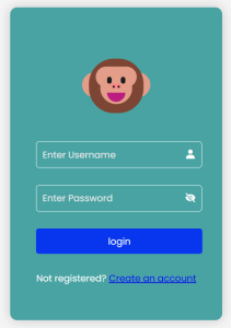
I have made a simple login form with a username and password to demonstrate the same.
HTML File
<!DOCTYPE html>
<html>
<head>
    <title>Login Page</title>
    <link rel="stylesheet" href="design_psh.css">
    <link href='https://unpkg.com/[email protected]/css/boxicons.min.css' rel='stylesheet'>
</head>
<body>
    <div class="container">
        <div class="emojis">
            <div class="normal emoji">🐵</div>
            <div class="closed emoji">🙈</div>
        </div>
        <form class="login-form">
            <div class="input-group">
                <input type="text" placeholder="Enter Username" id="textIP" required/>
                <i class="bx bxs-user"></i>
            </div>
            <div class="input-group">
                <input type="password" id="password" placeholder="Enter Password"/>
                <i class='bx bxs-hide' id="icon"  aria-hidden="true"></i>
            </div>
            <button class="loginBTN">login</button>
            <p class="message">Not registered? <a href="#">Create an account</a></p>
        </form>
    </div>
    <script src="script_psh.js"></script>
</body>
</html>
Steps:
- Import the icons using the URL of Boxicons.
- Create a <div> with class=”container” and inside it make two divisions; one for displaying emojis and another for username and password input.
- Add a user icon for username and hide icon for password.
- Add a button for login and a message and registration link for the user if he has not registered yet.
CSS File
@import url('https://fonts.googleapis.com/css2?family=Poppins:ital,wght@0,100;0,200;0,300;0,400;0,500;0,600;0,700;0,800;0,900;1,100;1,200;1,300;1,400;1,500;1,600;1,700;1,800;1,900&display=swap');
*{
    font-family: "Poppins", sans-serif;
}
body {
    background-color: #f0f0f0;
    display: flex;
    justify-content: center;
    align-items: center;
    min-height: 100vh;
    background: whitesmoke;
    flex-direction: column;
}
.container {
    position: relative;
    z-index: 1;
    max-width: 360px;
    margin: 0 auto 100px;
    padding: 45px;
    text-align: center;
    box-shadow: 0 0 20px rgba(0, 0, 0, 0.2);
    border-radius: 12px;
    background:rgba(0, 128, 128, 0.703);
}
.emojis{
    display: flex;
    justify-content: center;
    align-items: center;
    margin-bottom: 20px;
}
.emoji{
    font-size: 7rem;
    cursor: pointer;
    user-select: none;
}
.normal, .closed{
    display: none;
}
.active{
    display: block;
}
.deactive{
    display: none;
}
.input-group {
    display: flex;
    align-items: center;
    margin-bottom: 20px;
}
.input-group input {
    width: 100%;
    margin-bottom: 10px;
    padding: 10px 10px;
    font-size: 16px;
    color: #fff;
    background: transparent;
    border:1.2px solid #fff;
    outline: none;
    border-radius: 5px;
    transition: all 0.4s;
}
input:focus{
    background-color: teal;
}
::placeholder{
    color: #edecec;
}
.input-group i {
    color: #fff;
    font-size: 20px;
    transform: translateY(-30%);
    margin-left: -30px;
    cursor: pointer;
}
.container button {
    width: 104%;
    margin-bottom: 10px;
    padding: 10px;
    border: none;
    border-radius: 5px;
    font-size: 16px;
    background-color: #0836ee;
    color: #fff;
    cursor: pointer;
}
.container button:hover {
    background-color: #0227cb;
}
.message {
    margin-top: 20px;
    text-align: center;
    color: #fff;
}
Steps:
- Here I have imported a font from Google to use in my code.
- Apply the styling to the body, container, and emojis.
- Apply styling to emoji and initially keep them hidden.
- “.active” should be used in JavaScript to display the monkey emoji as needed.
- Give styles to other elements.
JavaScript File
const normalFace = document.querySelector(".normal");
const closedFace = document.querySelector(".closed");
const icon = document.querySelector("#icon");

icon.addEventListener('click', function () {
    const passwordField = document.getElementById('password');
    const type = passwordField.getAttribute('type') === 'password'? 'text' : 'password';
    passwordField.setAttribute('type', type);

    this.className = type === 'password'? 'bx bxs-hide' : 'bx bxs-show';

    normalFace.classList.toggle("active", type === 'password');
    closedFace.classList.toggle("active", type === 'text');
});

window.addEventListener("load",()=>{
    normalFace.classList.add("active")
    closedFace.classList.remove('active');
})
Steps:
- normalFace selects the element with the class normal (🐵 emoji); closedFace selects the element with the class closed (🙈 emoji); icon selects the element with the id icon (the eye icon for toggling password visibility).
- Add an event listener that listens for click events on icon.
icon.addEventListener('click', function () { const passwordField = document.getElementById('password'); const type = passwordField.getAttribute('type') === 'password'? 'text' : 'password'; passwordField.setAttribute('type', type); - passwordField selects the input field with the id ‘password’.
- type checks the current type of password field. If it is ‘password’, it changes to ‘text’, otherwise, it changes to ‘password’.
- The class of the icon changes based on the type of the password field.
this.className = type === 'password'? 'bx bxs-hide' : 'bx bxs-show';
- If the type is password the class changes to ‘bx bxs-hide‘, and if the class is type the class changes to ‘bx bxs-show‘.
-
normalFace.classList.toggle("active", type === 'password');This adds ‘active’ class to the normalFace emoji if the type is password. If not, it removes the ‘active’ class.
-
closedFace.classList.toggle("active", type === 'text');This adds ‘active’ class to the closedFace emoji if the type is text. If not, it removes the ‘active’ class.
- When the window loads, normalFace emoji is displayed by default.
window.addEventListener("load", () => {
    normalFace.classList.add("active");
    closedFace.classList.remove('active');
});
Output:
Click on the link to see the complete functioning of Cool Password Show/Hide.
This is an awesome way to spruce up your login page by adding a cool password show/hide option.