In today’s digital landscape, an intuitive and visually appealing navigation bar is crucial for any online store. It not only enhances user experience but also reflects the brand’s identity. In this blog post, we will create a responsive navigation bar for an online mobile store using HTML, CSS, and JavaScript. We’ll also explore how to implement a modern dark color theme that improves readability and aesthetics.
Getting Started
To get started, you need to set up a basic HTML file structure. You can create three files:
index.html: The main HTML file.style.css: The CSS file for styling.script.js: The JavaScript file for interactivity.
Building the HTML Structure
The HTML structure consists of a navigation bar with a logo, navigation links, and a dropdown menu for product categories. Here’s the code for index.html:
<!DOCTYPE html>
<html lang="en">
<head>
    <meta charset="UTF-8">
    <meta name="viewport" content="width=device-width, initial-scale=1.0">
    <title>Online Mobile Store</title>
    <link rel="stylesheet" href="style.css"> <!-- Link to CSS file -->
</head>
<body>
    <header>
        <nav class="navbar">
            <div class="logo">MobileStore</div>
            <ul class="nav-links">
                <li><a href="#home">Home</a></li>
                <li class="dropdown">
                    <a href="#products" class="dropbtn">Products</a>
                    <div class="dropdown-content">
                        <a href="#smartphones">Smartphones</a>
                        <a href="#tablets">Tablets</a>
                        <a href="#accessories">Accessories</a>
                    </div>
                </li>
                <li><a href="#about">About Us</a></li>
                <li><a href="#contact">Contact</a></li>
            </ul>
            <div class="menu-toggle" id="mobile-menu">
                <span class="bar"></span>
                <span class="bar"></span>
                <span class="bar"></span>
            </div>
        </nav>
    </header>

    <main>
        <h1>Welcome to Our Online Mobile Store!</h1>
        <!-- Main content goes here -->
    </main>

    <script src="script.js"></script> <!-- Link to JS file -->
</body>
</html>
Styling with CSS
Next, we’ll style the navigation bar using CSS. The design will feature a dark theme, making the navbar stand out while ensuring easy readability. Here’s the code for style.css:
/* General Reset */
* {
    margin: 0;
    padding: 0;
    box-sizing: border-box;
}

body {
    font-family: 'Arial', sans-serif;
    background-color: #f4f4f4; /* Light grey background for contrast */
}

/* Navbar Styles */
header {
    background-color: #333; /* Dark background */
    color: #f9f9f9; /* Light text */
    position: relative; /* Positioning for dropdown */
}

.navbar {
    display: flex;
    align-items: center;
    justify-content: space-between;
    padding: 15px 20px;
}

.logo {
    font-size: 24px;
    font-weight: bold;
    color: #4CAF50; /* Green color for logo */
}

.nav-links {
    list-style: none;
    display: flex;
    position: relative; /* Required for absolute positioning of dropdown */
}

.nav-links li {
    margin: 0 15px;
    position: relative; /* Positioning for dropdown */
}

.nav-links a {
    color: #f9f9f9; /* Light text color */
    text-decoration: none;
    font-size: 18px;
    transition: color 0.3s;
}

.nav-links a:hover {
    color: #4CAF50; /* Green on hover */
}

/* Dropdown Styles */
.dropdown-content {
    display: none;
    position: absolute;
    background-color: #444; /* Darker background for dropdown */
    min-width: 160px; /* Minimum width */
    z-index: 1; /* Ensure it appears above other content */
    border-radius: 4px; /* Rounded corners */
    box-shadow: 0 4px 10px rgba(0, 0, 0, 0.5); /* Shadow for depth */
}

.dropdown-content a {
    color: #f9f9f9; /* Light text for dropdown */
    padding: 12px 16px;
    text-decoration: none;
    display: block; /* Block-level for full width */
    transition: background-color 0.2s; /* Smooth background color transition */
}

.dropdown-content a:hover {
    background-color: #4CAF50; /* Green background on hover */
}

.dropdown:hover .dropdown-content {
    display: block; /* Show dropdown on hover */
}

/* Mobile Menu Toggle */
.menu-toggle {
    display: none;
    flex-direction: column;
    cursor: pointer;
}

.bar {
    height: 4px;
    width: 25px;
    background-color: #f9f9f9; /* Light color for hamburger icon */
    margin: 3px 0;
}

/* Responsive Styles */
@media (max-width: 768px) {
    .nav-links {
        display: none;
        flex-direction: column;
        position: absolute;
        background-color: #333; /* Dark background for mobile menu */
        width: 100%;
        top: 60px; /* Positioning below the navbar */
        left: 0;
        padding: 15px 0;
        z-index: 1;
    }

    .nav-links li {
        margin: 10px 0;
    }

    .menu-toggle {
        display: flex;
    }

    .nav-active {
        display: flex;
    }

    .dropdown-content {
        position: relative; /* Change position for mobile */
        width: 100%; /* Full width for dropdown */
    }
}
Adding JavaScript for Interactivity
Finally, we’ll implement JavaScript to enable the mobile menu toggle and manage dropdown interactions. Here’s the code for script.js:
const mobileMenu = document.getElementById("mobile-menu");
const navLinks = document.querySelector(".nav-links");
const dropdowns = document.querySelectorAll(".dropdown");

mobileMenu.addEventListener("click", () => {
    navLinks.classList.toggle("nav-active");
});

// Event listener for dropdown on mobile
dropdowns.forEach(dropdown => {
    dropdown.addEventListener("click", () => {
        const dropdownContent = dropdown.querySelector(".dropdown-content");
        dropdownContent.classList.toggle("show");
    });
});

// Close dropdown when clicking outside
window.addEventListener("click", (event) => {
    if (!event.target.matches('.dropbtn')) {
        dropdowns.forEach(dropdown => {
            const dropdownContent = dropdown.querySelector(".dropdown-content");
            dropdownContent.classList.remove("show");
        });
    }
});
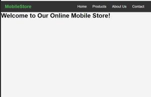
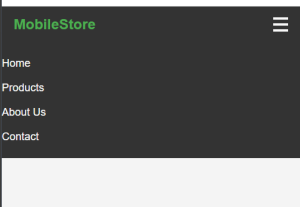
Output
Conclusion
In this tutorial, we’ve built a responsive navigation bar for an online mobile store that features a modern dark color theme, enhancing both aesthetics and usability. A well-designed navigation bar is crucial for providing a seamless shopping experience, guiding users effortlessly to their desired products.
With the incorporation of dropdown menus and mobile responsiveness, your navigation bar can adapt to various devices, ensuring accessibility for all users. The dark theme not only adds a touch of sophistication but also improves readability and user interaction.
As you continue to develop your online store, remember that a clean and functional navigation system can significantly impact user engagement and conversion rates. Feel free to modify and expand upon this foundation to better align with your brand’s identity.
If you have any questions or seek further enhancements, don’t hesitate to reach out. Happy coding, and may your online store thrive!