You will learn how to use HTML and CSS to design a responsive table by following this guide. This is especially beneficial so that consumers can enjoy a positive experience across various screen resolutions.
We can make a responsive table that functions on desktop and mobile devices by combining HTML and CSS.
Kindly ask any queries you may have about the tutorial in the comment section. Furthermore, please read the instructions and try to understand how it will work if you are not experienced with using HTML to create a responsive table.
Program to create a responsive table
<!DOCTYPE html>
<html lang="en">
<html lang=”en”>. This tag opens the HTML document and indicates the language of the content by setting the language attribute to “en” (English).
Heading Snippet
<head>
    <meta charset="UTF-8">
    <meta name="viewport" content="width=device-width, initial-scale=1.0">
    <title>Code Speedy: Responsive Table</title>
    <link rel="stylesheet" type="text/css" href="styles.css">
</head>
In our project, I used ‘Code Speedy: Responsive Table’ as the title.
With the ‘<link>‘ tag, we can incorporate the CSS file in the HTML.
table {
    width: 100%;
    border-collapse: collapse;
  }
  th, td {
    padding: 8px;
    text-align: left;
    border-bottom: 1px solid #ddd;
  }
  th {
    background-color: #f2f2f2;
  }

  @media screen and (max-width: 600px) {
    table, thead, tbody, th, td, tr {
      display: block;
    }
    thead tr {
      position: absolute;
      top: -9999px;
      left: -9999px;
    }
    tr { border: 1px solid #ccc; }
    td {
      border: none;
      border-bottom: 1px solid #eee;
      position: relative;
      padding-left: 50%;
      text-align: right;
    }
    td:before {
      position: absolute;
      top: 6px;
      left: 6px;
      width: 45%;
      padding-right: 10px;
      white-space: nowrap;
      content: attr(data-label);
      text-align: left;
      font-weight: bold;
    }
  }
The above CSS code applies to the desktop. We use the ‘@media screen’ to code the CSS for the mobile.
In our example, we are going to set the screen to always be mobile, where max-width is 600px.
If the screen size is 600 pixels or less, then the below CSS code will apply to HTML; otherwise, it will be above one.
Body Snippet
<body>
<table>
  <h2>Invoice:</h2>
  <thead>
    <tr>
      <th>Fruit</th>
      <th>Unit Price</th>
      <th>Quantity</th>
      <th>Total Price</th>
    </tr>
  </thead>
  <tbody>
    <tr>
      <td data-label="Fruit">Apple</td>
      <td data-label="Unit Price">Rs 60/-</td>
      <td data-label="Quantity">3</td>
      <td data-label="Total Price">Rs 180/-</td>
    </tr>
    <tr>

    </tr>
    <tr>

    </tr>
  </tbody>
</table>
</body>
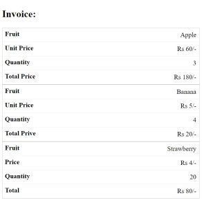
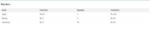
In the body tag, we created the table using the ‘<table>’ tag, and we added the information regarding the invoice for the fruits. We added three fruits to the table, having fruit type, unit price, quantity, and total price as the table headings.
We added the table data for the respective fruit data using the ‘<td>’ tag.
Output
The below images show the difference between tables on desktop and mobile.
Desktop View
Mobile View