If you are tired of basic looking charts and want to create stunning, publication ready visualizations with just a few line of code then Seaborn is your best friend.
In this tutorial , i will walk you through the basics of Seaborn and show you how to make elegant visualizations quickly and easily.
What are we building?
We are going to create :
- A colorful bar chart
- A smooth line plot
- A simple scatter plot
- And a clean box plot
All using Seaborn – a high level plotting library built on top of matplotlib.
How does it work?
Seaborn simplifies visualizations by:
- Automatically applying beautiful styles
- Handling grouped data easily
- Integrating perfectly with pandas Data Frames
Just give Seaborn your Data Frames and column names and it does the rest.
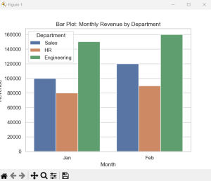
1. Bar Plot
A bar plot shows the average value of a variable for each category. If you have grouped or categorial data and want to compare group means , this is your go to.
Use case:
- Track revenue or sales growth over time
- Compare trends across multiple groups(e.g. departments, regions)
Code:
import pandas as pd
import seaborn as sns
import matplotlib.pyplot as plt
data = pd.DataFrame({
    'Department': ['Sales', 'Sales', 'HR', 'HR', 'Engineering', 'Engineering'],
    'Month': ['Jan', 'Feb', 'Jan', 'Feb', 'Jan', 'Feb'],
    'Revenue': [100000, 120000, 80000, 90000, 150000, 160000]
})
sns.set_theme(style="whitegrid")
sns.barplot(data=data, x='Month', y='Revenue', hue='Department')
plt.title("Bar Plot: Monthly Revenue by Department")
plt.show()
Output:
2. Line Plot
A line plot is used for time series or ordered data. It connects data points with lines and is ideal for observing trends over time.
Use Case:
- Track revenue or sales growth over time
- Compare trends across multiple groups
Code:
import pandas as pd
import seaborn as sns
import matplotlib.pyplot as plt
data = pd.DataFrame({
    'Department': ['Sales', 'Sales', 'HR', 'HR', 'Engineering', 'Engineering'],
    'Month': ['Jan', 'Feb', 'Jan', 'Feb', 'Jan', 'Feb'],
    'Revenue': [100000, 120000, 80000, 90000, 150000, 160000]
})
sns.set_theme(style="darkgrid")
sns.lineplot(data=data, x='Month', y='Revenue', hue='Department', marker='o')
plt.title("Line Plot: Monthly Revenue Trend")
plt.show()
Output:
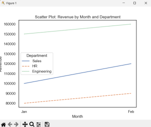
3. Scatter Plot
A scatter Plot shows the relationship between two continuous variables. You can group by category using color and shape.
Use Case:
- Visualize correlation(e.g. revenue vs customer count)
- Spot clusters, trends, outliers
Code:
import pandas as pd
import seaborn as sns
import matplotlib.pyplot as plt
data = pd.DataFrame({
    'Department': ['Sales', 'Sales', 'HR', 'HR', 'Engineering', 'Engineering'],
    'Month': ['Jan', 'Feb', 'Jan', 'Feb', 'Jan', 'Feb'],
    'Revenue': [100000, 120000, 80000, 90000, 150000, 160000]
})
sns.set_theme(style="white")
sns.lineplot(data=data, x='Month', y='Revenue', hue='Department', style='Department')
plt.title("Scatter Plot: Revenue by Month and Department")
plt.show()
Output:
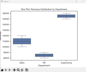
4. Box Plot
A box plot shows the distribution of data through
- Median(Center line)
- Quartiles(box edges)
- Min/Max values(whiskers)
- Outliers(dots)
Use Case:
- Analyze spread and skewness of revenue across departments
- Detect outliers and variance
Code:
import pandas as pd
import seaborn as sns
import matplotlib.pyplot as plt
data = pd.DataFrame({
    'Department': ['Sales', 'Sales', 'HR', 'HR', 'Engineering', 'Engineering'],
    'Month': ['Jan', 'Feb', 'Jan', 'Feb', 'Jan', 'Feb'],
    'Revenue': [100000, 120000, 80000, 90000, 150000, 160000]
})
sns.set_theme(style="ticks")
sns.boxplot(data=data, x='Department', y='Revenue')
plt.title("Box Plot: Revenue Distribution by Department")
plt.show()
Output: