Using Pandas and Seaborn, this lesson explores exploratory data analysis (EDA) in Python, covering fundamental ideas, methods for exploring data, and visualization using real-world examples. It’s intended to improve your capacity for efficient data trend analysis and interpretation.
EDA in Python Using Pandas and Seaborn
The steps involved are illustrated in the code below. Follow the sequence to understand the implementation process.
Step 1: Import Libraries
#Importing Libraries
import pandas as pd
import seaborn as sns
import matplotlib.pyplot as plt
Step -2: Load the Dataset
# Load the dataset
df = pd.read_csv('/content/data.csv')
Step 3: Handling Missing Data
# Drop rows with missing values
df_cleaned = df.dropna()

# Alternatively, you can fill missing values
# df_filled = df.fillna(value=...)
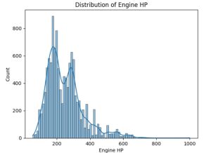
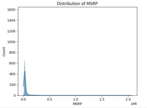
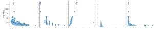
Step 4: Visualizing Distributions of Numerical Variables
# Distribution of Engine HP
sns.histplot(df['Engine HP'], kde=True)
plt.title('Distribution of Engine HP')
plt.show()
# Distribution of MSRP
sns.histplot(df['MSRP'], kde=True)
plt.title('Distribution of MSRP')
plt.show()
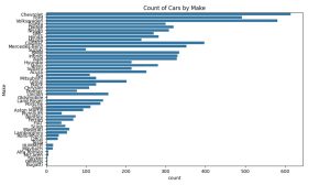
Step 5: Analyzing Categorical Variables
# Count plot for 'Make'
plt.figure(figsize=(10, 6))
sns.countplot(y='Make', data=df_cleaned, order=df['Make'].value_counts().index)
plt.title('Count of Cars by Make')
plt.show()

# Count plot for 'Transmission Type'
sns.countplot(x='Transmission Type', data=df_cleaned)
plt.title('Count of Cars by Transmission Type')
plt.show()
![]()
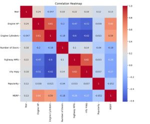
Step 6: Correlation Analysis
# Select only the numerical columns from the dataset
numerical_df = df_cleaned.select_dtypes(include=['float64', 'int64'])
# Calculate the correlation matrix for numerical columns only
corr = numerical_df.corr()

# Plot the heatmap
plt.figure(figsize=(10, 8))
sns.heatmap(corr, annot=True, cmap='coolwarm')
plt.title('Correlation Heatmap')
plt.show()
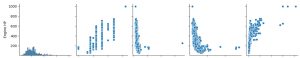
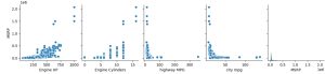
Step 7: Pairplots for Numerical Variables
# Pairplot for selected numerical features
sns.pairplot(df_cleaned[['Engine HP', 'Engine Cylinders', 'highway MPG', 'city mpg', 'MSRP']])
plt.show()
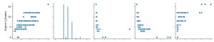
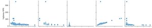
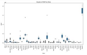
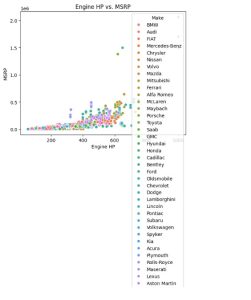
Step 8: Analyzing Relationships Between Features
# Boxplot of MSRP vs. Make
plt.figure(figsize=(15, 8))
sns.boxplot(x='Make', y='MSRP', data=df_cleaned)
plt.xticks(rotation=90)
plt.title('Boxplot of MSRP by Make')
plt.show()

# Scatter plot of Engine HP vs. MSRP
sns.scatterplot(x='Engine HP', y='MSRP', hue='Make', data=df_cleaned)
plt.title('Engine HP vs. MSRP')
plt.show()