Data visualization plays a key role in data analysis. It helps us grasp trends, distributions, and patterns . This guide will show you how to use Python to make two types of charts: a bar chart and a histogram. These charts will help you see how categorical and continuous variables are spread out.
Prerequisites
To follow along, make sure you have the following libraries installed:
pip install matplotlib seaborn pandas
1. Creating a Bar Chart for Categorical Data:
A bar chart is useful for visualizing categorical data. Let’s consider an example where we analyze the distribution of genders in a population
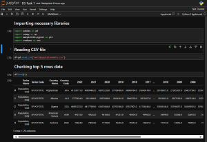
import pandas as pd
import matplotlib.pyplot as plt
data = pd.read_csv("population.csv")
data.head(266)
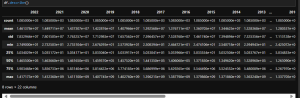
 data.describe
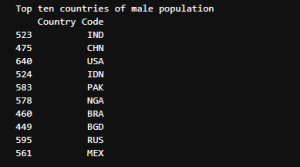
#filter data for male population
male_population_data = df[df[‘Series Code’]==’SP.POP.TOTL.MA.IN’]
#sort data based on the male population for 2022
male_population_sorted =male_population_data.sort_values(by=”2022″,ascending=False)
#Get the top 10 countries with the highest male population for 2022
male_top_ten_countries = male_population_sorted .head(10)
print(“Top ten countries of male population”)
print(male_top_ten_countries[[‘Country Code’]])
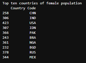
#filter data for male population
female_population_data = df[df[‘Series Code’]==’SP.POP.TOTL.FE.IN’]
#sort data based on the male population for 2022
female_population_sorted =female_population_data.sort_values(by=”2022″,ascending=False)
#Get the top 10 countries with the highest male population for 2022
female_top_ten_countries = female_population_sorted .head(10)
print(“Top ten countries of female population”)
print(female_top_ten_countries[[‘Country Code’]])
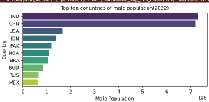
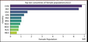
Top ten countries with highest male and female population in 2022
# Create the bar plot
plt.figure(figsize=(15, 6))
plt.subplot(2,2,1)
sns.barplot(x=”2022″, y=”Country Code”, data=male_top_ten_countries, palette=”viridis”)
plt.title(“Top ten conuntries of male population(2022)”,fontsize=10)
plt.xlabel(“Male Population”,fontsize=10)
plt.ylabel(“Country”,fontsize=10)
plt.show()
# Create the bar plot
plt.figure(figsize=(15, 6))
plt.subplot(2,2,2)
sns.barplot(x=”2016″, y=”Country Code”, data=female_top_ten_countries, palette=”viridis”)
plt.title(“Top ten conuntries of female population(2022)”,fontsize=10)
plt.xlabel(“Female Population”,fontsize=10)
plt.ylabel(“Country”,fontsize=10)
plt.show()
Conclusion
By using bar charts for categorical variables and histograms for continuous variables, we can effectively analyze data distributions in Python. This approach is useful in various fields, including business analytics, machine learning, and statistics.