Covid-19 Data Visualization using Plotly-Python
 Sai Koushik Kalakota
Oct 02, 2020
Sai Koushik Kalakota
Oct 02, 2020
In this project, I am going to visualize country and continent wise COVID-19 dataset by the end of this project you can learn basic plotting with Plotly.
Data Visualization is the graphical representation of data which consists of various plots and charts. It is mainly used to establish the relationship
between variables so that we can understand the data in a much better way and we can also derive lots of insights from the data through visualization
that can help the business models to achieve their targets
So let's get started
First, you need to import the required libraries to visualize the data
import pandas as pd
import matplotlib.pyplot as plt
import plotly.offline as py
py.init_notebook_mode(connected = True)
import plotly.graph_objs as go
import plotly.express as px
from plotly.subplots import make_subplots
import plotly.io as pio
You have imported all the required libraries so you are good to go, Next import the dataset of COVID-19 and read the data
covid_data = pd.read_csv('covid.csv')
covid_data.head()
Output:

Now remove columns with null values
covid_data = covid_data.drop(['NewCases','NewDeaths','NewRecovered'],axis=1)
Now let's create some functions that are helpful to create new columns in the data
def trunc(x):
    r = round(x,2)
    return r

def trunc1(x):
    r = round(x,0)
    return r
these functions are used to round the float data
Let's create new columns
covid_data['Percentage_affected'] = ((covid_data['TotalCases']/covid_data['Population'])*100).apply(trunc)
covid_data['Recovery_percentage'] = ((covid_data['TotalRecovered']/covid_data['TotalCases'])*100).apply(trunc)
covid_data['Death_percentage'] = ((covid_data['TotalDeaths']/covid_data['TotalCases'])*100).apply(trunc)
covid_data['Serious_Percentage'] = ((covid_data['Serious,Critical']/covid_data['TotalCases'])*100).apply(trunc)
Now we have created four new columns which represent the percentage of people affected by COVID and the recovery percentage of affected people
and the death percentage of affected people and the percentage of people whose condition is serious.
Let's start the data visualization part:
The population of top 15 countries with most COVID-cases
px.bar(covid_data.head(15),x='Country/Region',y='Population',color = 'Population',
       hover_data = ['Country/Region','Continent'])
Output:

Total Number of Cases in each continent:
px.bar(continent_group,x='Continent',y='TotalCases',color = 'Continent',
       hover_data = ['TotalCases','Continent'])
Output:

No. of cases in the top 15 countries with most COVID cases
px.bar(covid_data.head(15),x='Country/Region',y='TotalCases',color = 'Country/Region',
       hover_data = ['Country/Region','Continent'])
Output:

Deaths in the top 15 countries with most COVID cases
px.bar(covid_data.head(15),x='Country/Region',y='TotalDeaths',color = 'Country/Region',
       hover_data = ['Country/Region','Continent'])
Output:

No of Recovered people in the top 15 countries with most COVID cases
px.bar(covid_data.head(15),x='Country/Region',y='TotalRecovered',color = 'Country/Region',
       hover_data = ['Country/Region','Continent'])
Output:
No of Tests in the top 15 countries with most COVID cases
px.bar(covid_data.head(15),x='Country/Region',y='TotalTests',color = 'Country/Region',
       hover_data = ['Country/Region','Continent'])
Output:

No of Tests in each continent
px.bar(covid_data.head(15),x='Continent',y='TotalTests',color = 'Country/Region',
       hover_data = ['Country/Region','Continent'])
Output:

Distribution of data of TotalCases, TotalDeaths and TotalRecovered:
fig = make_subplots(rows=1, cols=3,subplot_titles=("Total Cases", "Total Deaths", "Total Recovered"),column_widths=[1, 1,1])
fig.add_trace(go.Box(y=covid_data['TotalCases'],name="Total Cases"),row=1, col=1)
fig.add_trace(go.Box(y=covid_data['TotalDeaths'],name="Total Deaths"),row=1, col=2)
fig.add_trace(go.Box(y=covid_data['TotalRecovered'],name="Total Recovered"),row=1, col=3)
fig.show()
Output:

TotalCases per Population percentage of top 10 countries with most COVID cases
fig = go.Figure([go.Pie(labels=covid_data.head(10)['Country/Region'], values=covid_data.head(10)['Percentage_affected'])])
fig.show()
Output:
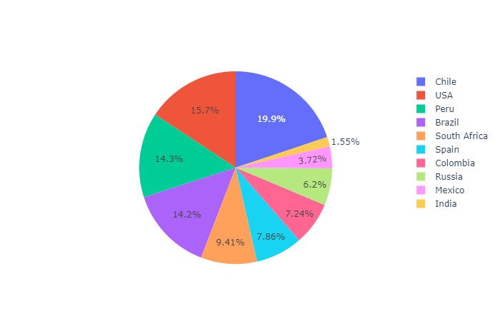
The recovery rate of the top 10 countries with most COVID cases
fig = go.Figure([go.Pie(labels=covid_data.head(12)['Country/Region'], values=covid_data.head(12)['Recovery_percentage'])])
fig.show()
Output:
Deaths per TotalCases Percentage of top 10 countries with most COVID cases
fig = go.Figure([go.Pie(labels=covid_data.head(10)['Country/Region'], values=covid_data.head(10)['Death_percentage'])])
fig.show()
Output:

Serious Cases per Total Cases of top 10 countries with most COVID cases
fig = go.Figure([go.Pie(labels=covid_data.head(10)['Country/Region'], values=covid_data.head(10)['Serious_Percentage'])])
fig.show()
Output:

So this is the basic visualization of COVID-19 dataset with Plotly-python.
Project Files
| .. | ||
| This directory is empty. | ||
