Youtube Data Analysis using Python
 Sai Koushik Kalakota
Oct 08, 2020
Sai Koushik Kalakota
Oct 08, 2020
In this project, I am going to analyse and visualize data generated by Youtube by the end of this project you can learn how to analyse text data and text cleaning and basic plotting with Plotly.
Data Visualization and analysis is the graphical representation of data which consists of various plots and charts. It is mainly used to establish the
relationship between variables so that we can understand the data in a much better way and we can also derive lots of insights from the data through
the visualization that can help the business models to achieve their targets.
So Let's get started:
First, you need to import all the required libraries
import numpy as np
import pandas as pd
import matplotlib.pyplot as plt
import plotly.express as px
import plotly.graph_objects as go
from textblob import TextBlob
from plotly.offline import iplot
import emoji
import re
from wordcloud import WordCloud,STOPWORDS
import seaborn as sns
Now import the dataset required to perform analysis
data = pd.read_csv(r"UScomments.csv", error_bad_lines=False)
data.head()
Output:

Let's perform the sentiment analysis on comments on each video
polarity=[]

for com in data['comment_text']:
    try:
        polarity.append(TextBlob(com).sentiment.polarity)
    except:
        polarity.append(0)

data['polarity'] = polarity
data.head(10)
Output:
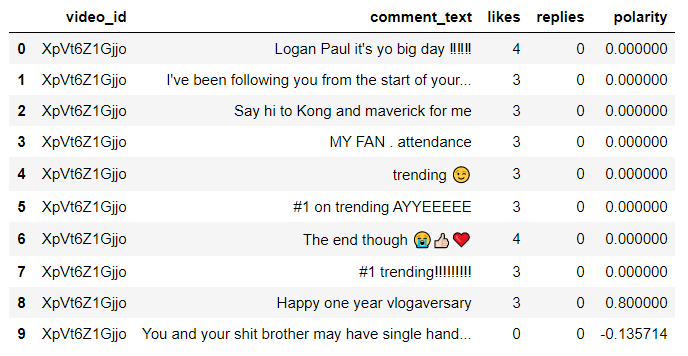
here polarity stores the sentiment of each comment in the data as a list and it has been added to the data frame. Polarity 0 indicates neutral, 1
indicates positive and -1 indicates negative.
Let's filter all the positive comments and perform text analysis
total_comment = (' '.join(positive_comments['comment_text']))
wordcloud_positive = WordCloud(width=1000,height=500,stopwords = set(STOPWORDS)).generate(total_comment)
plt.figure(figsize=(15,15))
plt.imshow(wordcloud_positive)
plt.axis('off')
Output:
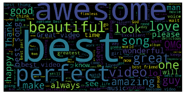
The above output indicates the most common positive words that are used in comments are highlighted in big size.
Let's analyse the negative comments in data
negative_comments = data[data['polarity']==-1]
total_comment_negative = (' '.join(negative_comments['comment_text']))
wordcloud_negative = WordCloud(width=1000,height=500,stopwords = set(STOPWORDS)).generate(total_comment_negative)
plt.figure(figsize=(15,5))
plt.imshow(wordcloud_negative)
plt.axis('off')
Output:

The above output indicates the most common negative words that are used in comments are highlighted in big size.
Now let's load another dataset to perform text and numerical analysis on youtube data
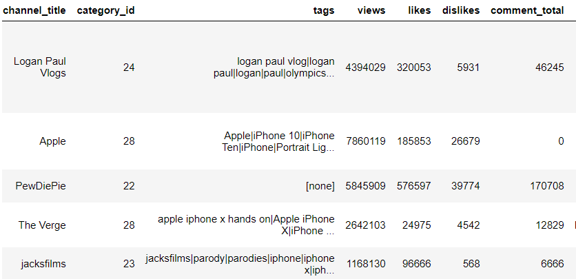
data_videos = pd.read_csv(r"C:\Users\saiko\Desktop\USvideos.csv", error_bad_lines=False)
data_videos.head()
Output:
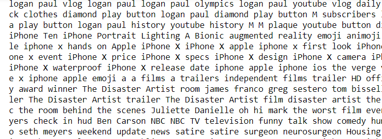
Let's perform text analysis on tags in a youtube video. So first we need to clean the tags data in order to perform text analysis.
tags_complete= (' '.join(data_videos['tags']))
tags=re.sub('[^a-zA-Z]',' ',tags_complete)
tags=re.sub(' +',' ',tags)
print(tags)
Output:
Let's visualize the tags data
wordcloud_tags = WordCloud(width = 1000, height = 500,stopwords=set(STOPWORDS)).generate(tags)
plt.figure(figsize=(15,5))
plt.imshow(wordcloud_tags)
plt.axis('off')
Output:

We can see most used tags for youtube videos are highlighted big in size.
Project Files
| .. | ||
| This directory is empty. | ||
